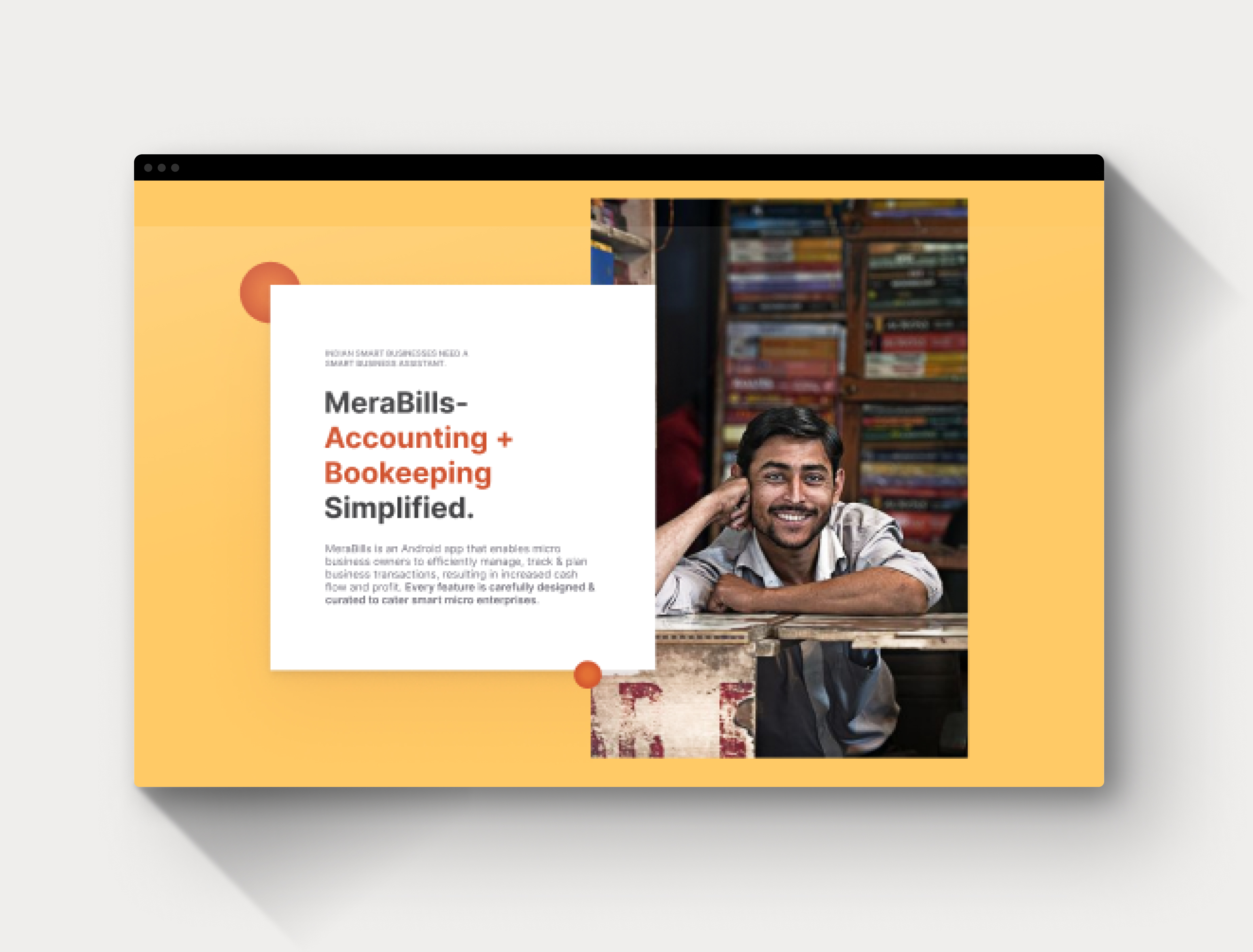
Platform: Web
My role: Research, Ideation, Content, UX Design, Interaction Design, Prototyping
Redesigning Merabill’s Website would act as a primary marketing asset for their Financial management app designed for small business owners.
Context:
This project is a part of my Internship project at Merabiils & my role here included conducting user research & analysis, developing content that catered to target users and redesigning their website.
Company Profile: MeraBills is a fintech startup that is developing an Android app that aims to help small and unorganized sectors by keeping track of their income, expenses, and other transactions. Their user base range from small business owners, micro-entrepreneurs, Cottage Industries, service providers to NGOs, SHGs, and Entrepreneurship training organizations.
Define
Why it needs a Redesign?
After a careful analysis of the Merabills website, I drew the following conclusion of why it needed a redesign:
- There was no proper CTA (Call to Action) on the website. Moreover, it is placed in such a place that the user has to figure out on their own.
- There was no trust build-up when the user views it for the first time.
- The main highlights of their product (the Merabills app) is not properly conveyed to the extent that it is easily understandable.
- No way to understand how the app works.
Project Goal:
Essentially a website is a ‘marketing tool’ and a company like this with its Primary product being a fintech app would want to build an impactful website that will bring in partners and investors.
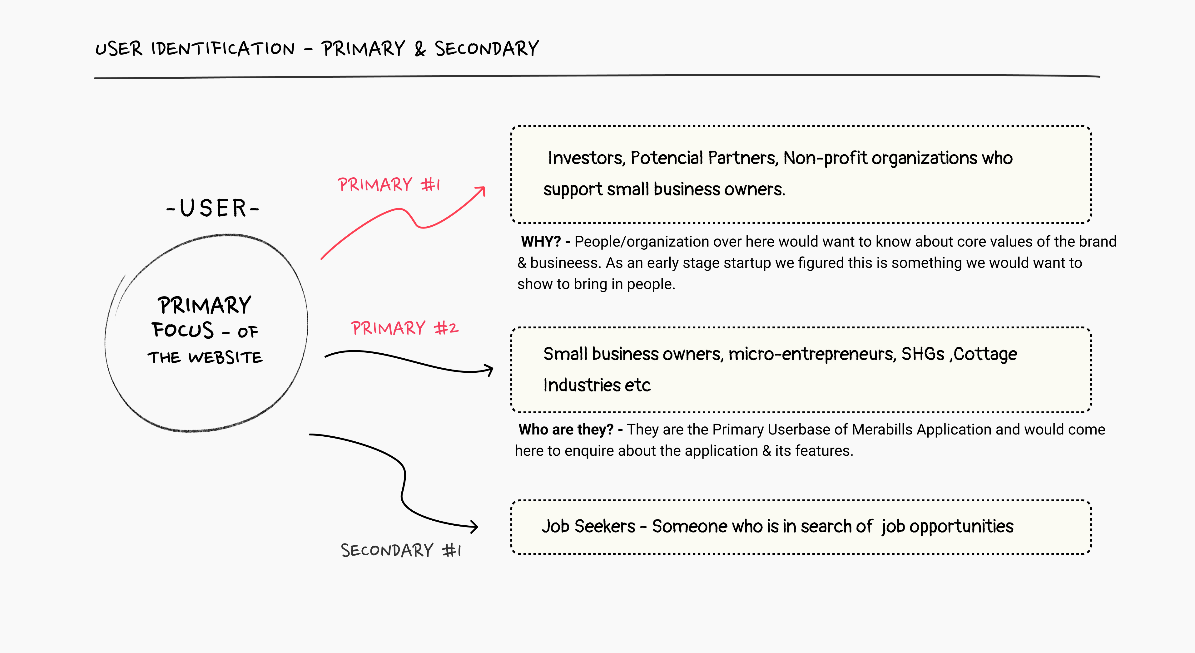
Primary User Identification:
Identified the Primary userbase (Target audience) & the secondary users which would keep me guided while deciding the structure, navigation & flow of the site.
Research:
At this stage, I decided to do a Comparative analysis & User Research study and gain more understanding of the industry & understanding the userbase.
Competition/ Comparative Analysis
An extensive competitor analysis was conducted with organizations or companies directly related to Merabills’s business model, I analysed the information structure, layout, tone, and navigation.
Key Findings:
Khatabook
-
- Khatabook’s tone is friendly, directed towards its users ie, small business owners in India, which provides the users with a strong sense of trust towards the brand.
-
- Very Impactful and direct copywriting - For example ‘Small business Big dreams’
OkCredit
- Most visually exciting website.
- A very interesting section that communicates about the product’s reach across the country.
- ‘Contact us’ option in the navigation bar directs users to a page where there’s a brief audio-video tutorial (also has captions in Hindi ) showing users of the app how to contact them in quite an interesting way.
- A very useful section on the landing page ‘ Our Team’ - which talk about the type of people leading the team and the teammates, which my opinion plays a big role when it comes to investors taking a look at the product.
Dukaanshala
- When the user scrolls down it hides the ‘navigation bar’ & has to scroll up to get access, which I think forms a challenge here.
- Overall site architecture is decent enough, although
- A lot of inconsistencies in layout as well as the visual hierarchy, which can lead to confusion for the user.
Common observations across all websites observed above;
- Placement of ‘Get the app’ or ‘Download from play store CTA → is an important design pattern to consider for redesign, as it enables anyone to directly check out the app. For the existing website, this link is placed right at the bottom, which forms a disadvantage.
- Another interesting pattern observed was that each website had a unique way of presenting or highlighting some key features of the product.
User Research
UX research method- Secondary (For common data collection).
Primary User #1
People/organizations who would want to know about the core brand values, vision, impact, reach & business of Merabills. They can be channel partners, investors, potential partners, and Non-profit organizations that support small business owners, SHGs, banks, CSR corporates, etc.
Thereafter I tried to understand,
- Who are these users?
- The information they would like to view while taking a look at the website?
- Where can we improve the site to cater to this set of audiences?
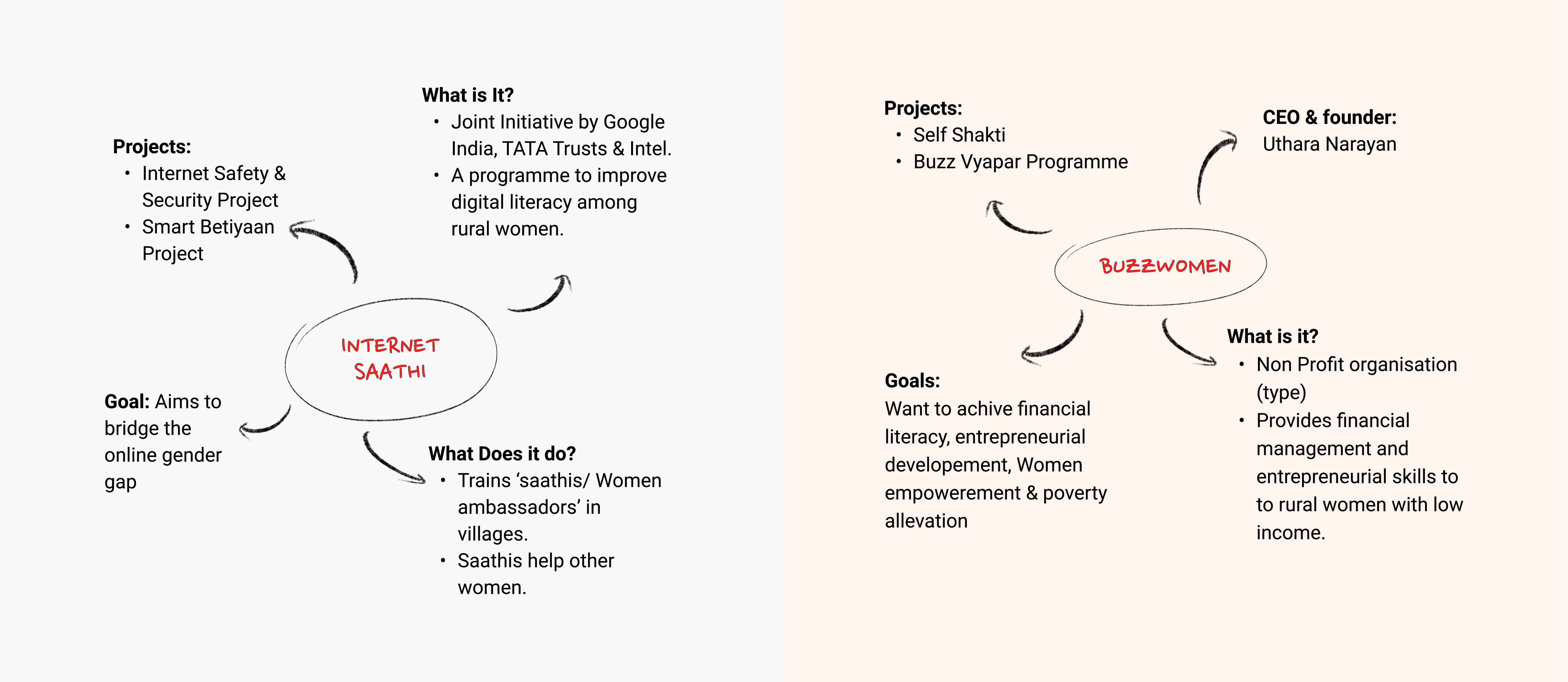
Brands & organisations I studied in this process: TATA Trust, Buzzwomen, Internet Saathi, FWWB, Dhriti Organisation. Below displayed are some insights mapped out for two organisations:
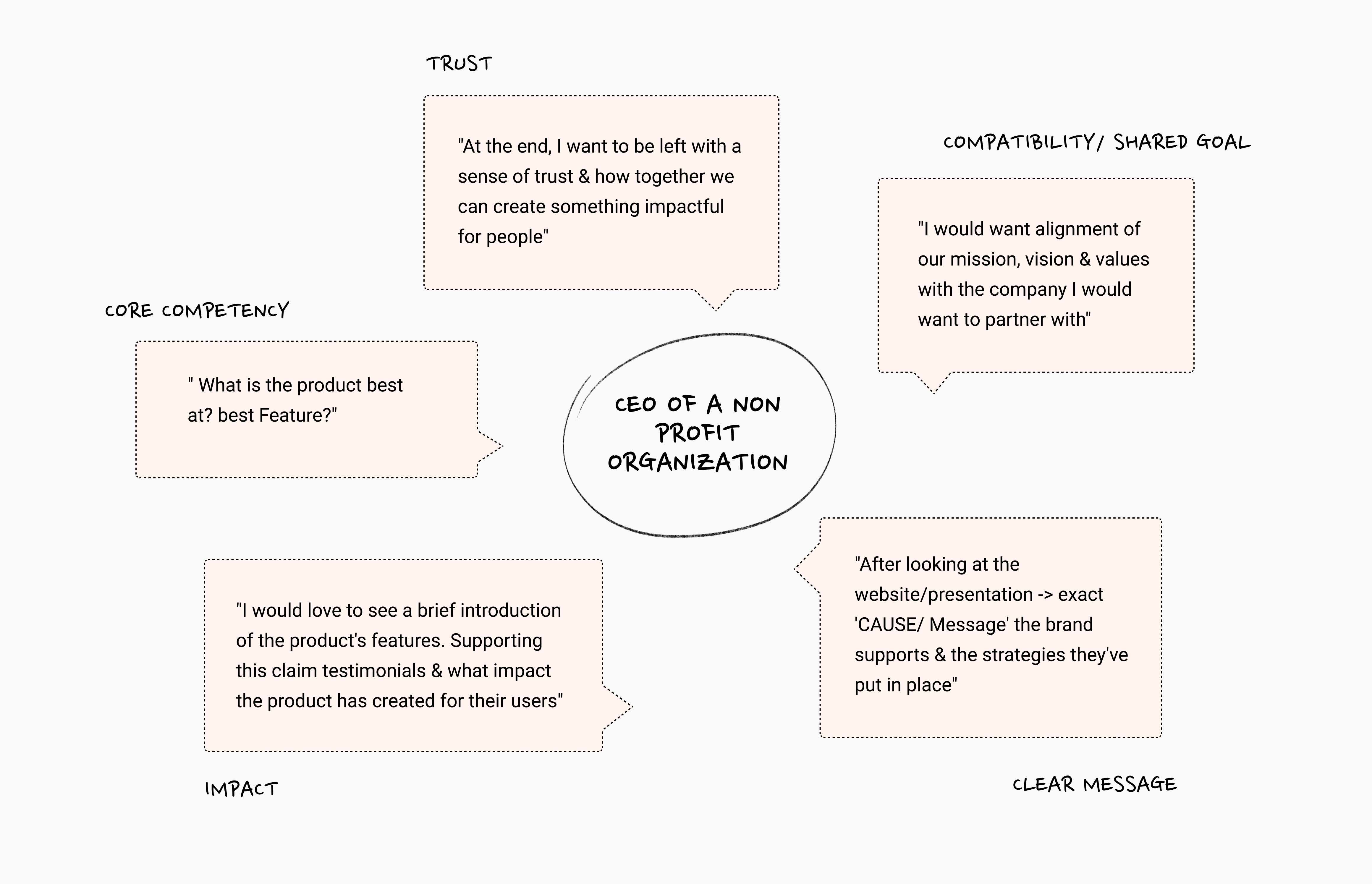
How the user would perceive the site & what factors affect it? Here’s a small chart showing that;
Ideation
The information architecture of the content & the structure was defined while discussion with the team, taking into account what exactly is needed and what isn’t necessary.
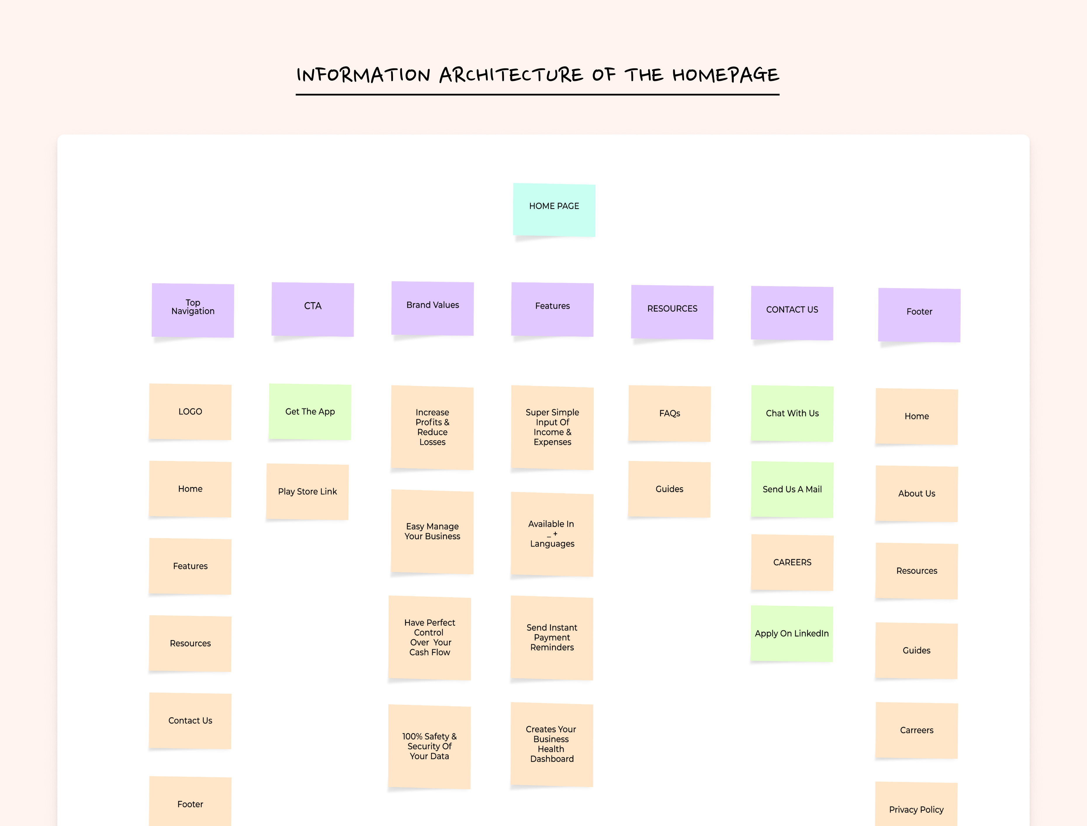
Problem: Now with the IA structure our main components were defined, but we still needed to figure out the navigation.
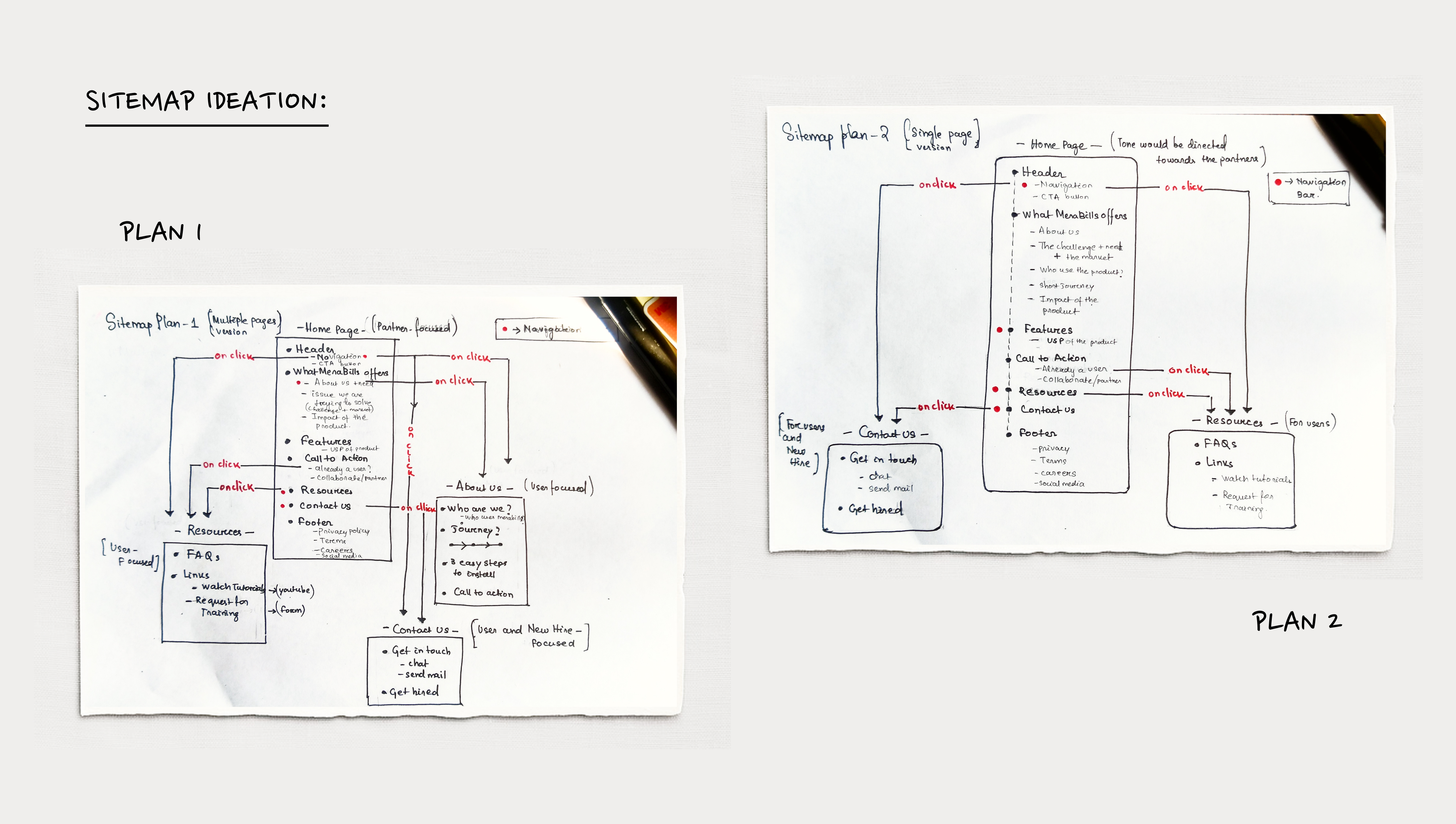
Solution: To solve this I came up 2 different types of sitemap ideas →
- one which is a single-page layout having all the information and links focused primarily on the Primary user #1.
- the second one, a multiple-page version where different pages cater to a different set of audiences.
Brain- storming Workable flows:
I went to giving 6 different flow ideas, among which I decided the one which was the most appropriate in regards to the user and the brand.
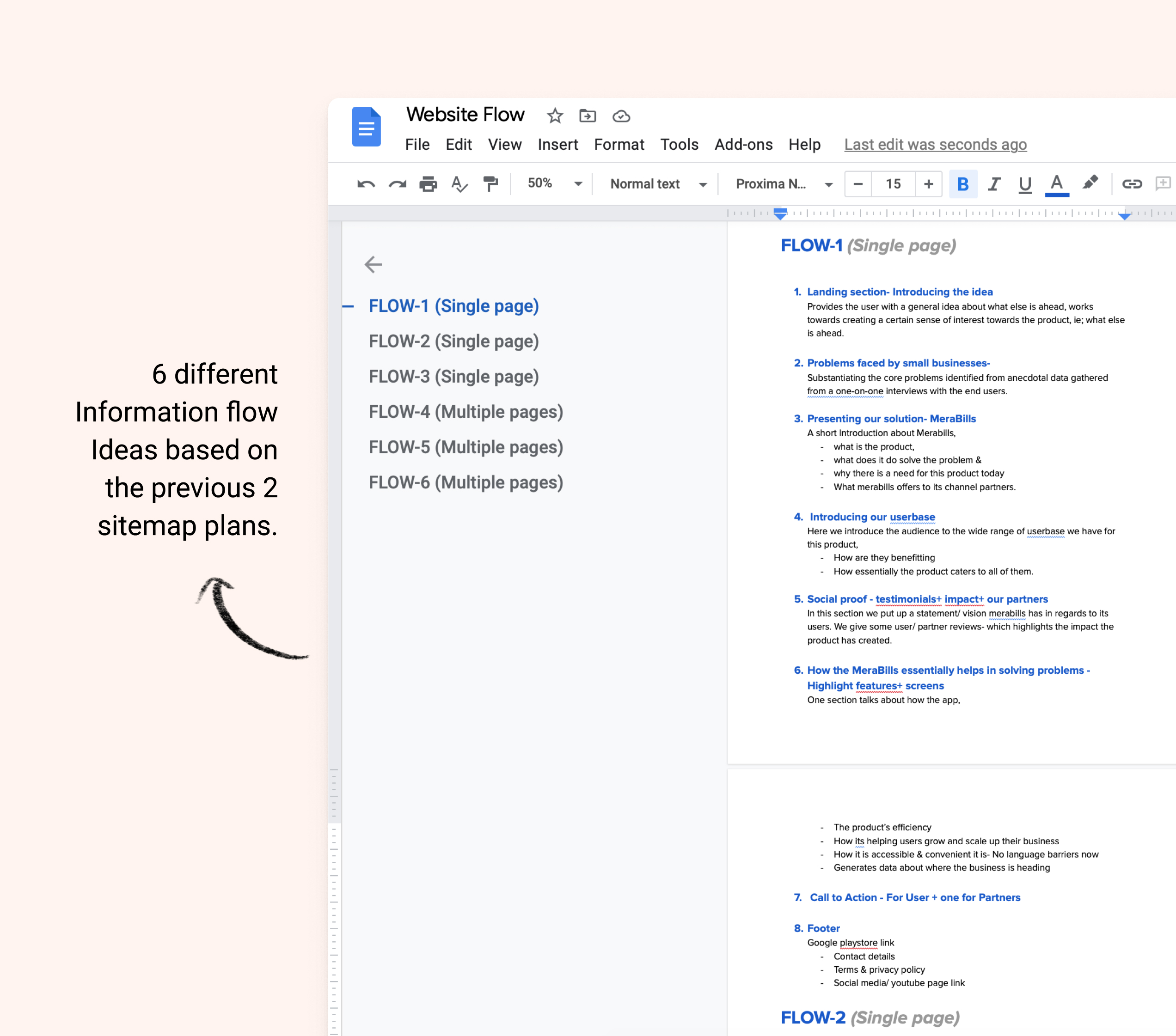
Result: We decided on having a single-page website, as the information we thought there was very little information to put up for Secondary audiences and making a separate page for that wouldn’t really solve any existing problem or create a massive impact. Showing that on the page, where the user gets scrolled down or up to the desired section on the same page was a much better experience than numerous clicks that come with separate pages.
Content Development:
While coming up with the content for the website I kept in mind the primary user and the tone and the writeup was catered essentially towards the primary user, ie; Potential Partners/ present stakeholders to build trust and confidence among them towards MeraBills.
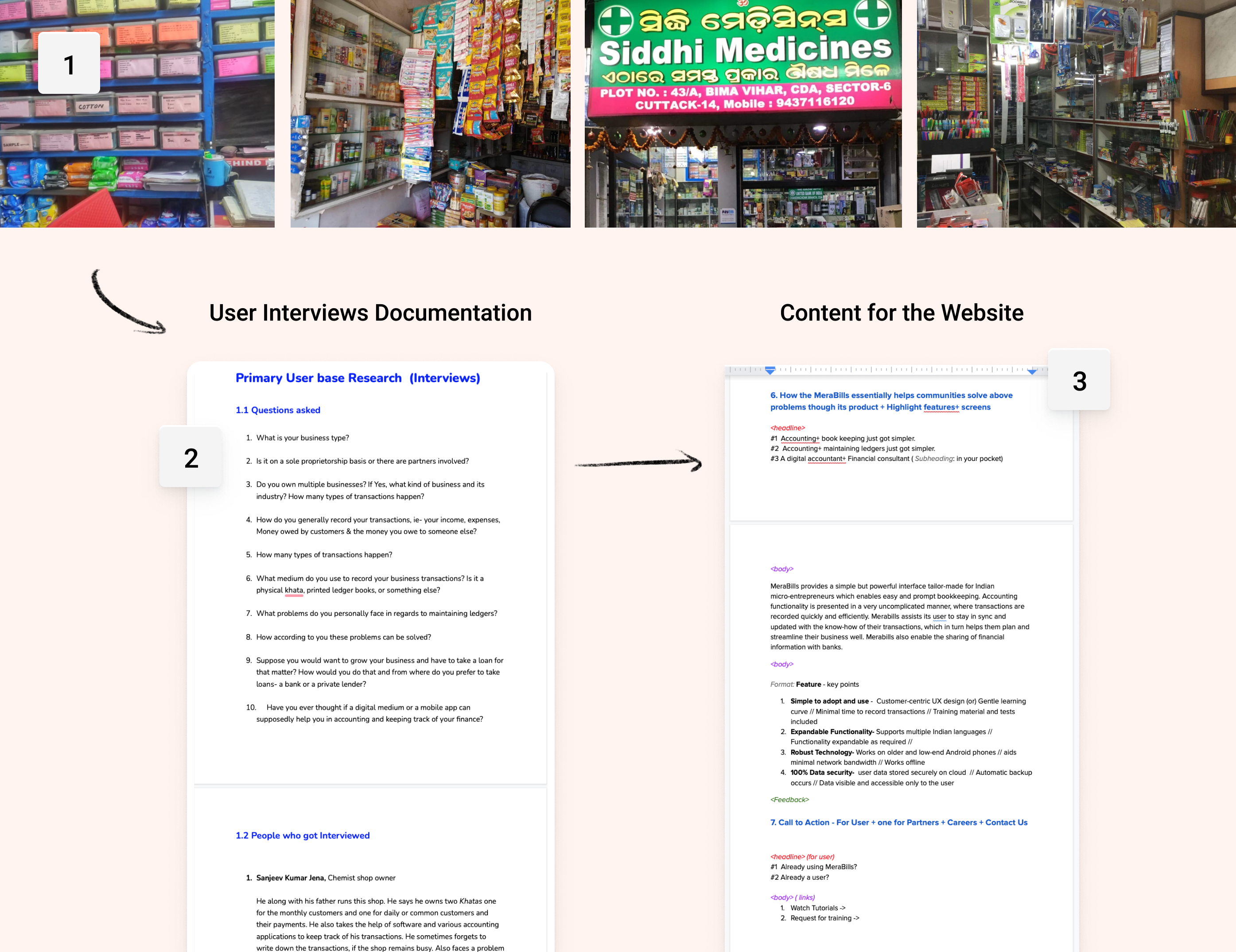
We had a section where we wanted to show the problem users face and some anecdotal evidence backing that up.
Alongside this project, I had also conducted & documented user Interviews of few people around my city who own small businesses → to gain a better understanding that would help Merabills effectively address the problem faced by the general primary users. The document was later useful as content for that section. Few shops I visited:
—
Design
I created quick low-fidelity paper prototypes to discuss the layouts I’m planning to implement. Based on comments and reviews from the team I completed a few rounds of iterations before arriving at the final layout. I also explored 4 very different Visual Styles one based on the existing website & the other three were my experiments.
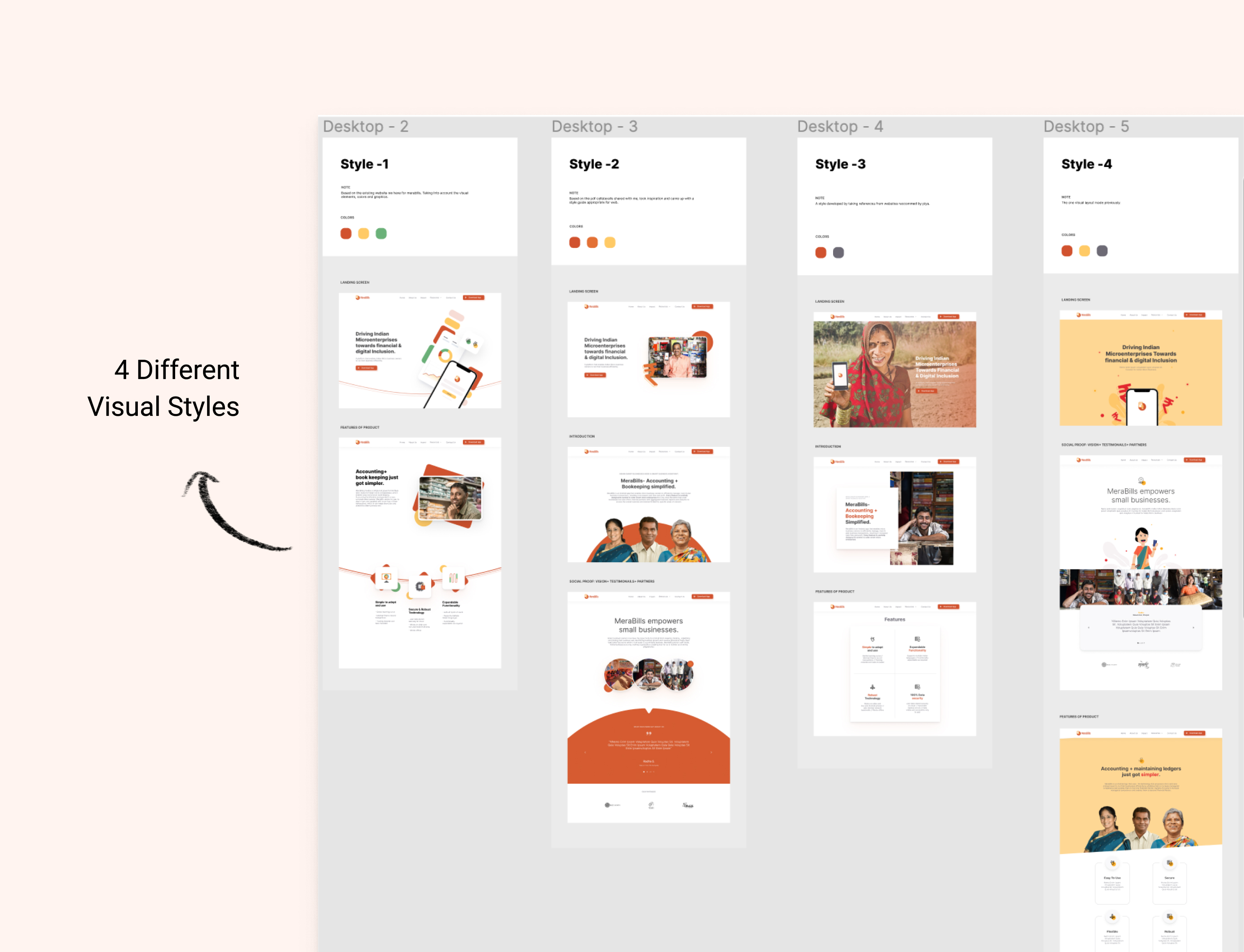
Then I went on to complete the final layout based on Style 3, as was approved by everyone and did prototyping for the same. Below displayed is the final website & its different sections.
