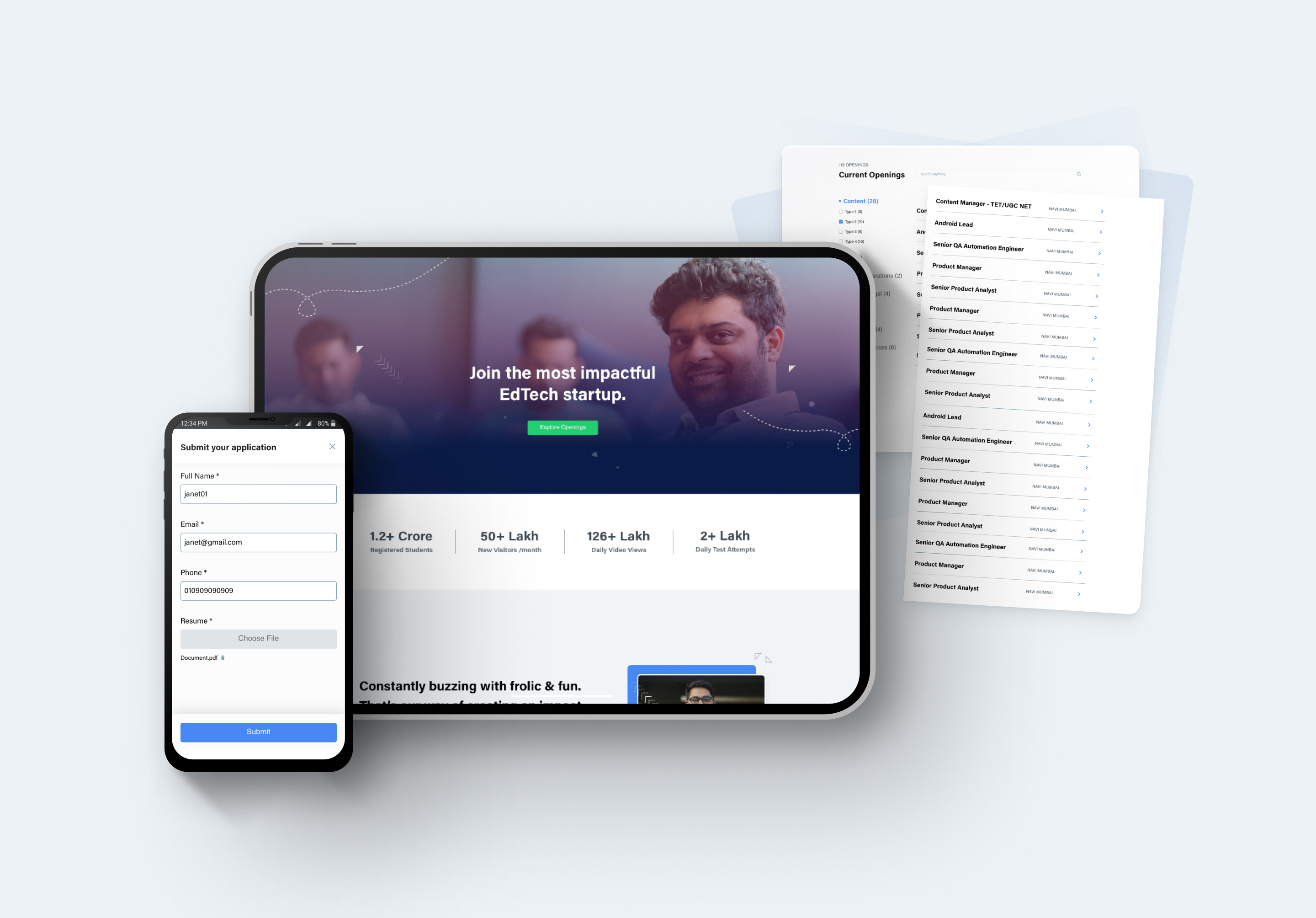
Platform: Web, Mobile Web
My role: Research, Ideation, UX Design, Interaction Design
Redesigning careers page experience for Jobseekers & allowing through an efficient online recruitment process.
Context:
This project is a part of my Internship project at Testbook & my role here was largely independent in building their careers page.
Company Profile: Testbook provides free tailored mock tests for users, with upgradable plans for their live tests for different exams. They cater to students from the most remote pockets of the country, accessible in the form of Testbook.com (on the web), Testbook app (on phones & tabs), and even Partner Coaching & Online Centres (on-ground).
Problem statement
User Problems:
- Job Applicants (Target User) coming to the platform found it difficult to search for available job positions.
- No proper CTAs to navigate the user from point A(let’s say ‘starting a job search) to point B(reaching the job description page for the same) → such instances observed across main & its child pages.
Business Problems:
- Currently existing Career landing page for Testbook felt outdated as well as proved ineffective in communicating with the applicants company’s achievement & growth so far.
- ‘Job Search’ isn’t establishing in a quick & easy search & results.
Project goals:
- A home page that communicates well the company’s culture, their vision & the value that they put towards each employee.
- Streamlining Job Search by improving flow & introducing features for better navigation & experience to overcome frustrations of users.
- Addition of a dedicated section with content personalised to cater different teams.
- Guidelines setup with recruiting team defining the minimum and maximum Job requirement to list.
Research:
How I conducted my research ?
Secondary User Research Method: I read a few articles and interviews of job seekers applying online and discovered their pain points. I also took into account the challenges I have faced as a user accessing career sites being an applicant.
Conclusions based on my findings:
Given that most candidates have to go through a few rounds after getting shortlisted,
- Most candidates seek jobs from multiple places, they generally take a quick glance, so they want desired information(differs from person to person, but common points include employee benefits, work culture etc) to be quickly accessible without much pain.
- Users want to find (the desired job), reach+ read (Job description) & apply within a short span of time.
- Given that most candidates over a period of time have to go through a few rounds after getting shortlisted, they desired a short & simple application process.
- Bonus→ if the current employees tell a little bit of inside story concerning the kind of work & culture they’ve experienced here.
Possible solutions:
- Search field & Job filters introduction, that are easy to find and use.
- Testimonials/ blog pages having experiences of employees working at Testbook.
- Short easy to fill application form.
Ideation
First i started with defining the primary & secondary function of the page, which in future will guide me to ideate the possible flows which serve the defined functions.
Functionality: How and as what will this page Function as?
Primary function:
Current Openings section » leading the User( Applicant) to reach it’s Goal (Finding desired job profile as easily as possible)
Secondary Function:
Communicating about the company and the benefits of working here through Visuals+ Text » what this would do is build a certain sense of trust regarding the kind of work ethics, Positive experience they could expect etc.
Then I quickly drew out some low fidelity wireframes & decided upon pitching two different JOB SEARCH flows. The below picture explains what is the flow & how they navigate the user.
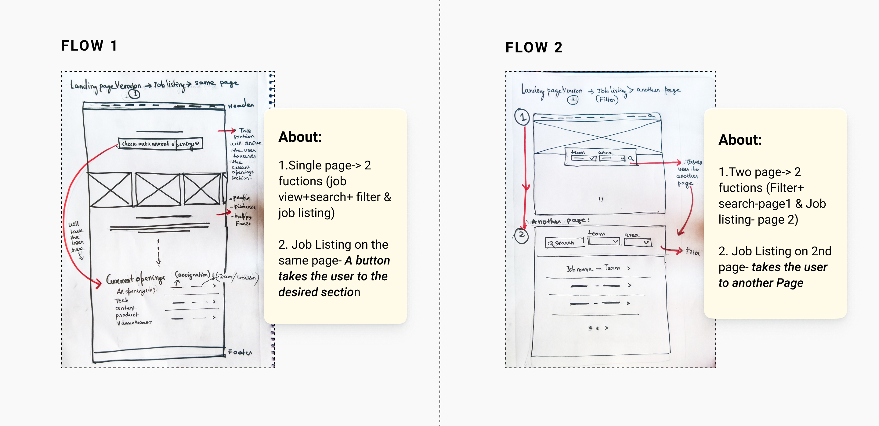
Had a discussion with my PM. Later on, we decided to go ahead with flow 1, because for the following reasons:
- User able to reach & see the job listing with a single click → filtering option comes after taking a glance at the openings, hence primary function performance was comparatively much easier.
- We observed flow 2 had a lot of two and fro. Even though job openings had separate page, there’s a huge chance we could let the user would miss out on performing the Secondary function for flow 2.
- In flow 1 while the button navigates the user to the job listing section at the bottom of the same page, flow 2 navigates to a different page. Intuitively, it’s easier to scroll up than to click back to the previous page.
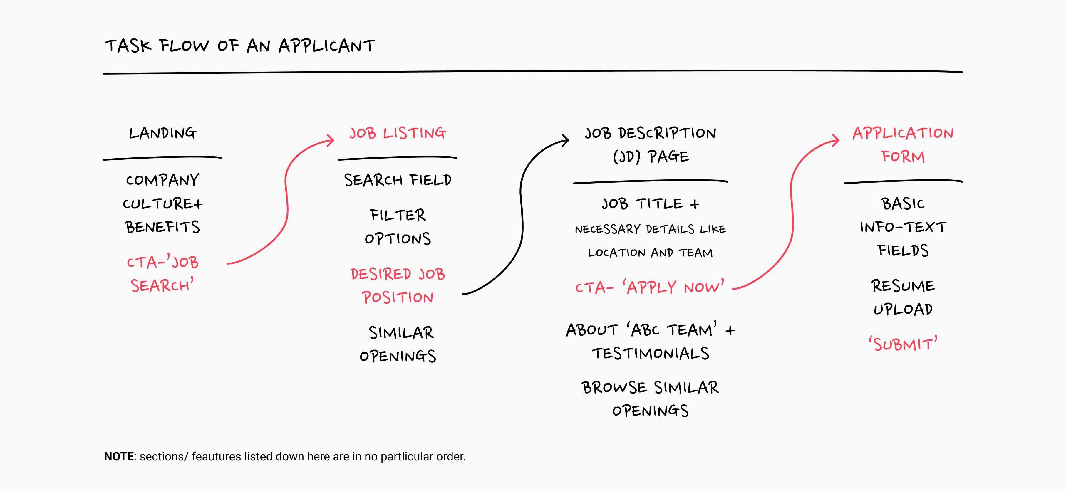
Below displays the discussed & finalised Task flow structure of an applicant coming to the platform:
Design
I went on to make high fidelity wireframes for both flows, to give a more clear view of what the pages would look like for the user. Through this process, I noticed the hierarchy of information too changed for each flow.
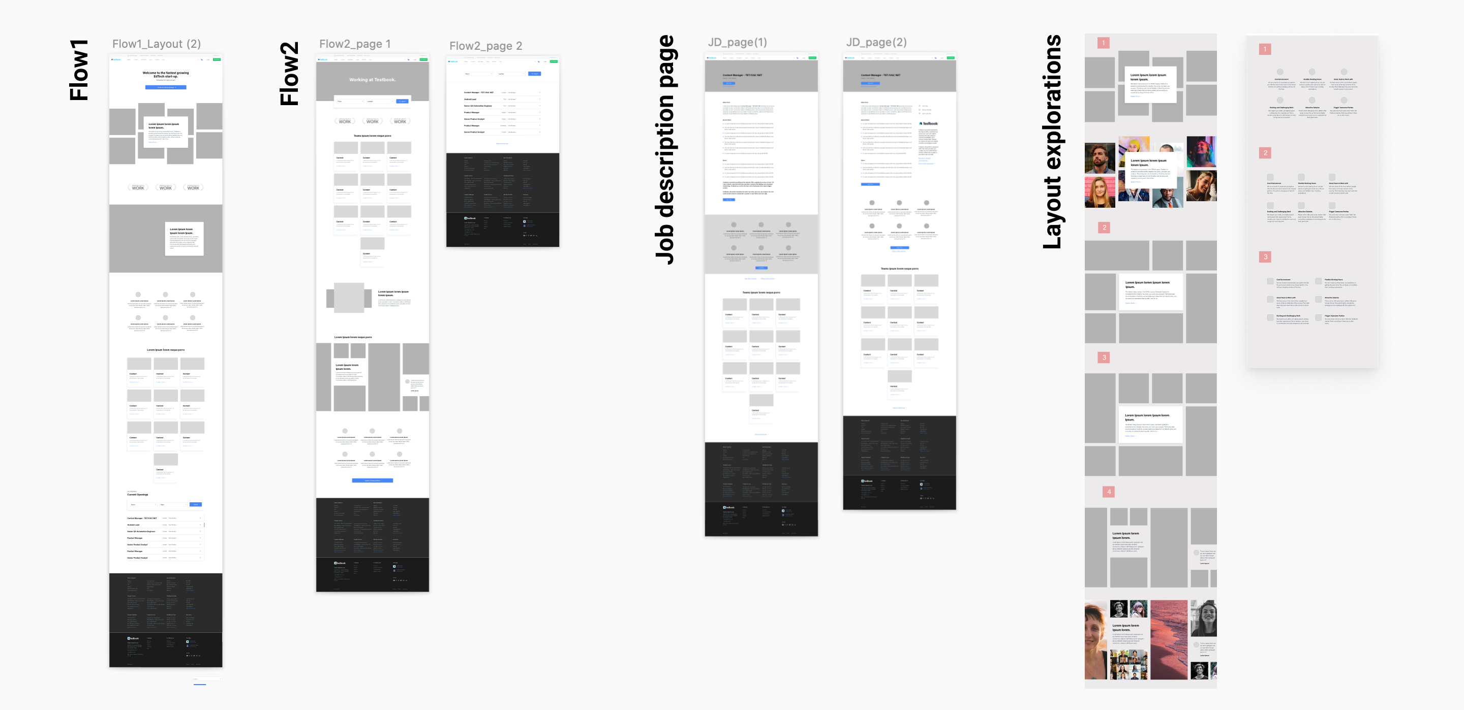
Web First Approach: We decided to go for this, as most users if not all, generally chose to apply from their laptop or desktop devices, as resume & other credentials are readily available.
I then explored a few ways through which the user would access the job listing section. Introduced the search & job filter options in a few different ways explained below:
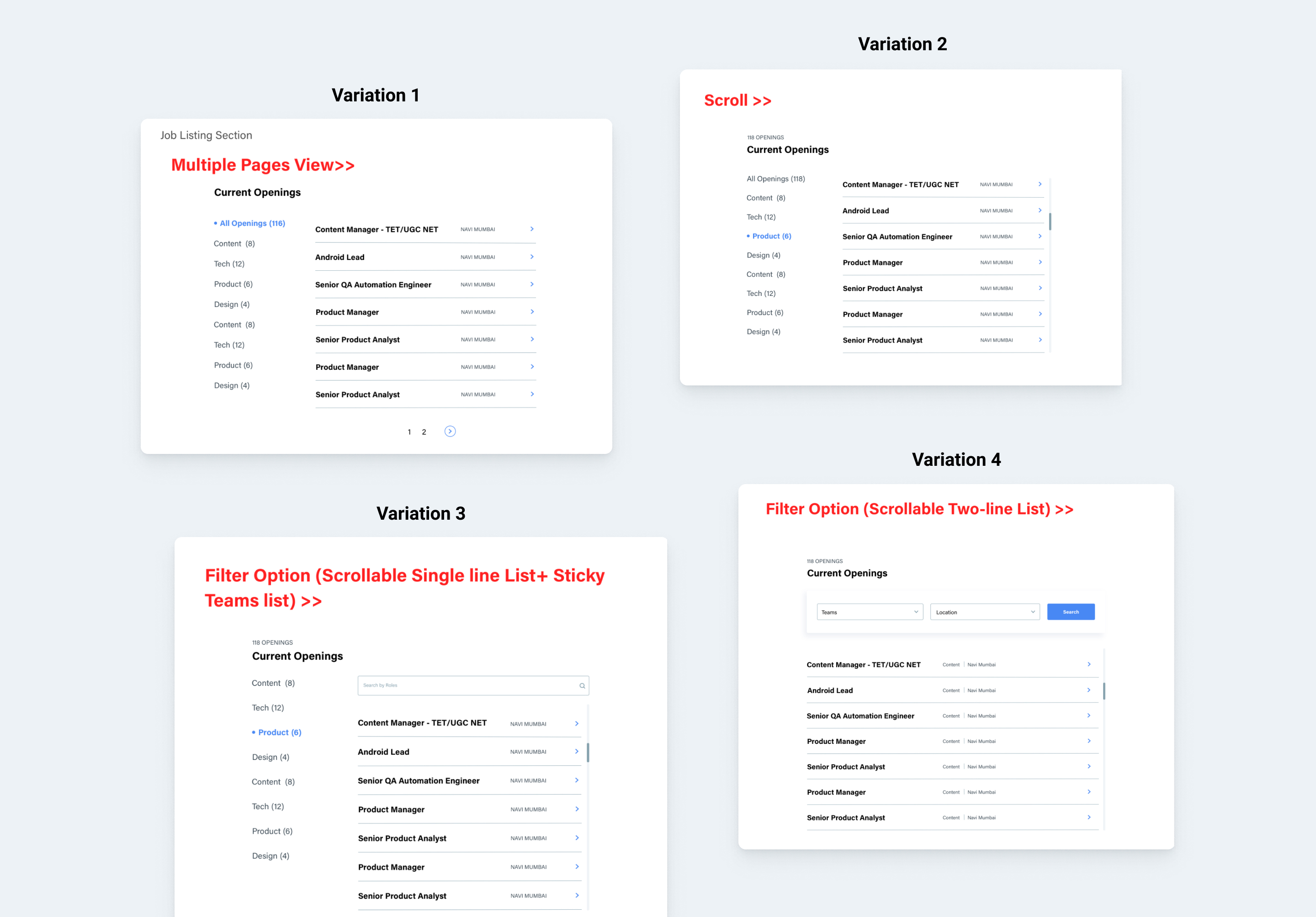
Problem we came across:
I noticed few teams having a large number of job openings and there was no way the user could easily identify the preferred job opportunity among these huge listings of jobs.
Solution:
Sub-categories among the job listings within the same team. I have displayed two variations of my solution below:
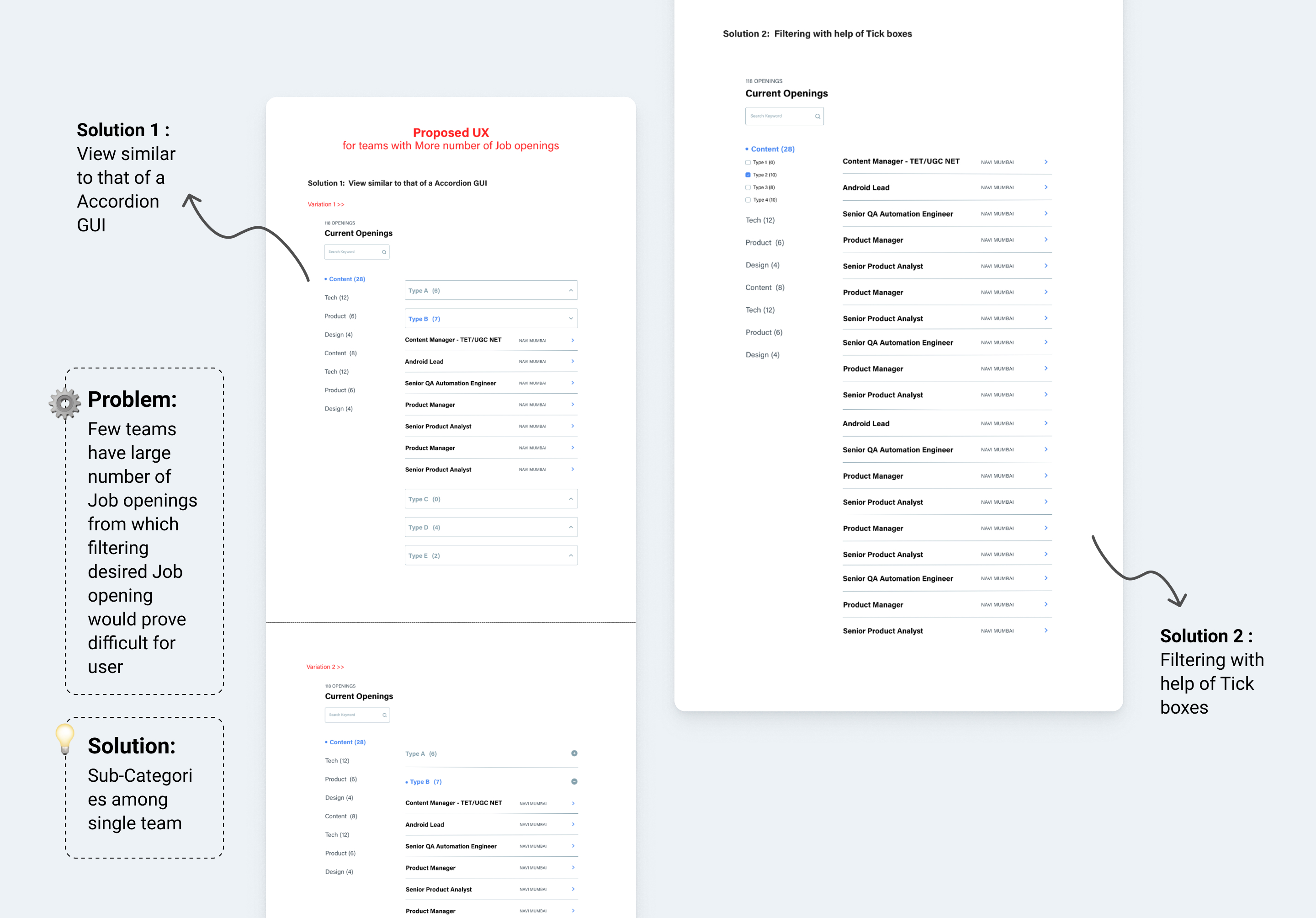
Result:
We found both solutions were equally solving the problem. Still, decided to go ahead with Solution 2 as the components used in it were in coherence with Testbook’s existing design system.
Job Description page:
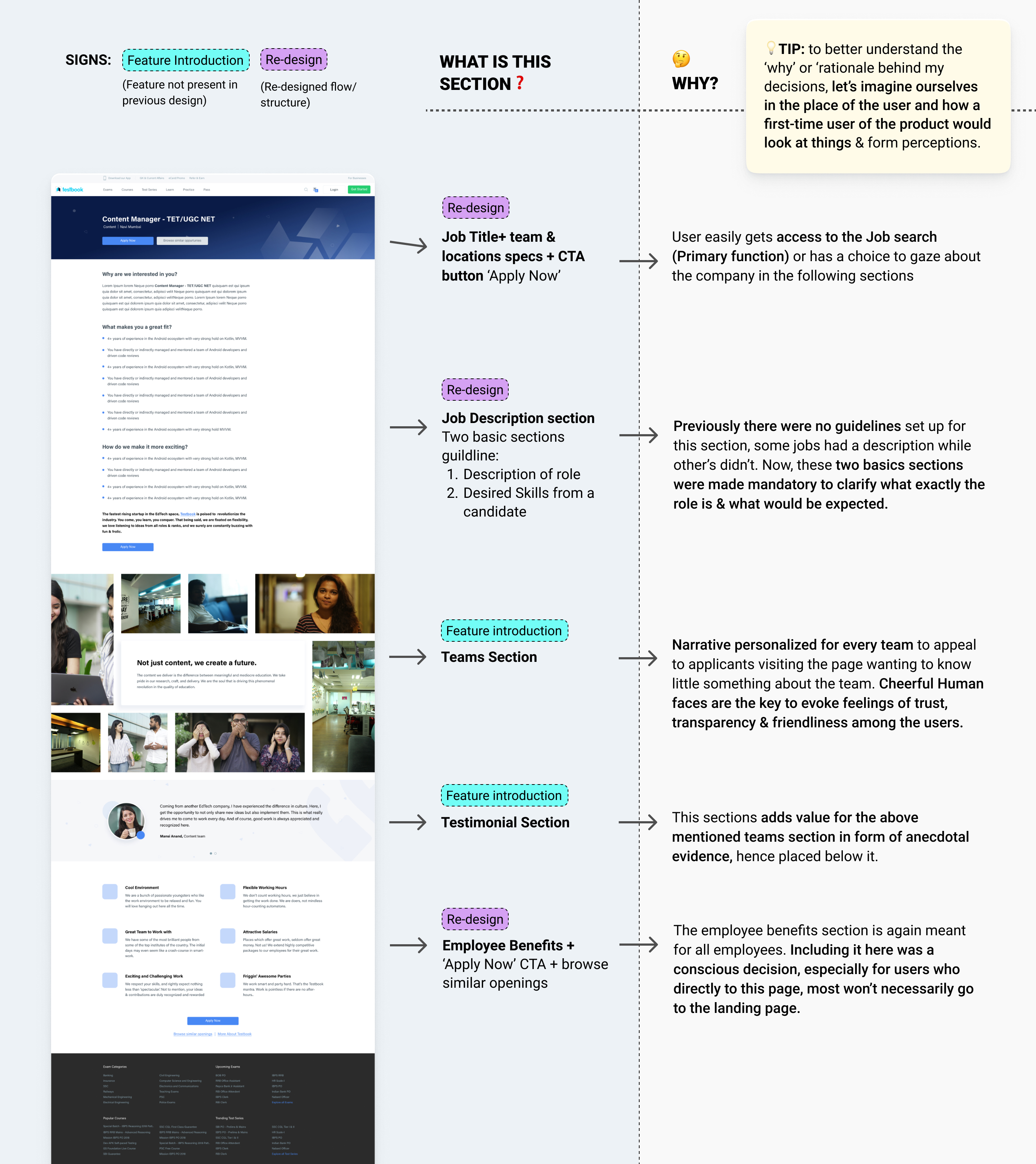
Data figures suggested more than half of the people end up coming directly to the JD page from other job recruitment websites such as LinkedIn, which means they don’t get to see the culture & benefits **(which they aspire to see) something a person who comes organically to the platform would be able to see.
This makes the JD page really important & equally necessary to construct the flow that would cater to this set of users. **
After the basic structure of both the landing page and Job Description page was defined, team-specific pages with content personalised according to them were also made.
Mobile Web Version:
I went ahead to build a Responsive Design structure for the Mobile web where features were optimised to be viewable,accessible & convenient for mobile users.
Below displayed are the landing page followed by JD page and the WHY behind the hierarchy of each section & comparison with previous designs:
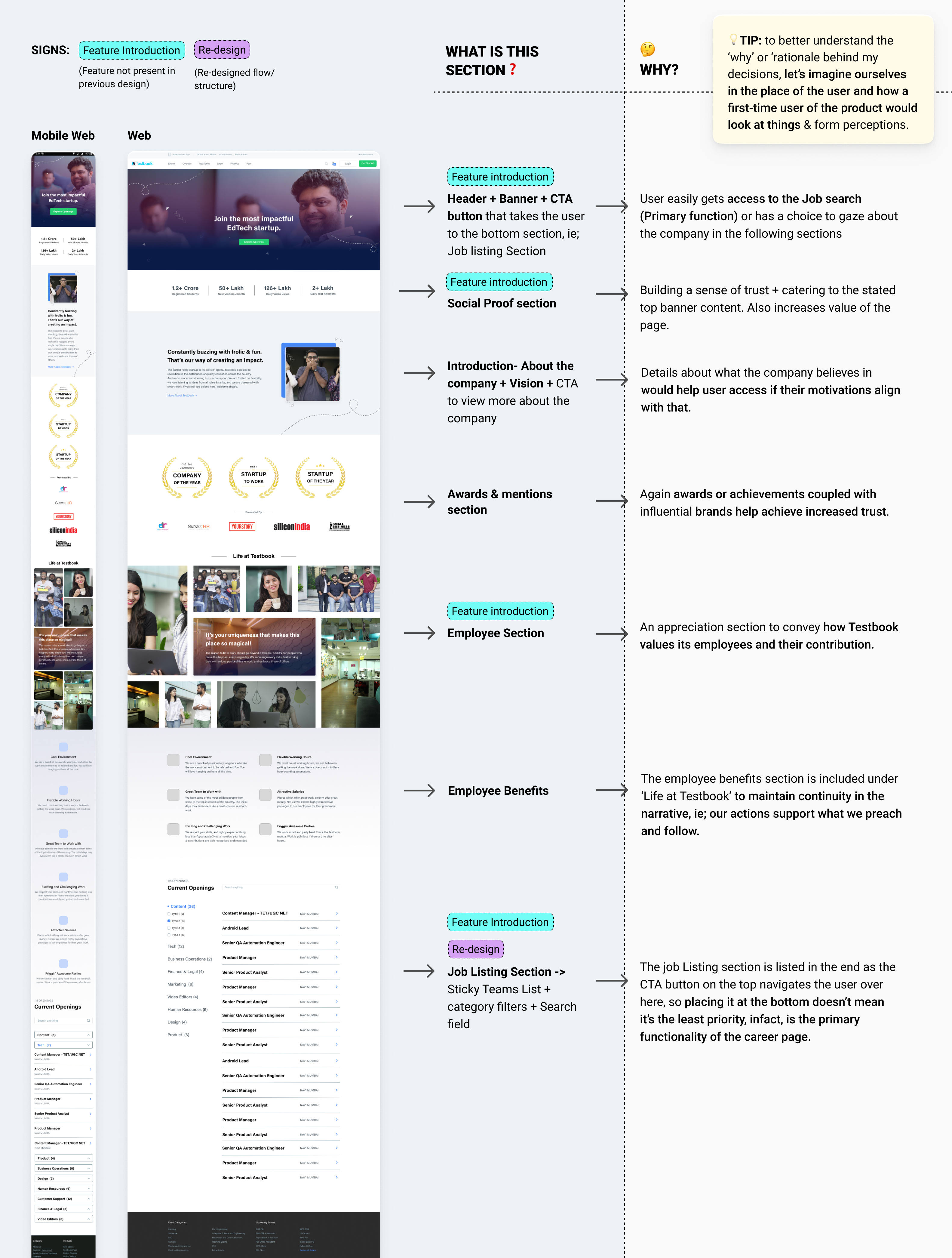
I believe deciding ‘when’ and ‘after what’ we show a certain thing plays a very important role in our narrative & the flow of information. It’s exactly like telling an engaging story, which has incredible potential to hook a listener (in this context →the user).
That said, let’s take a look at the finalised Job description page:
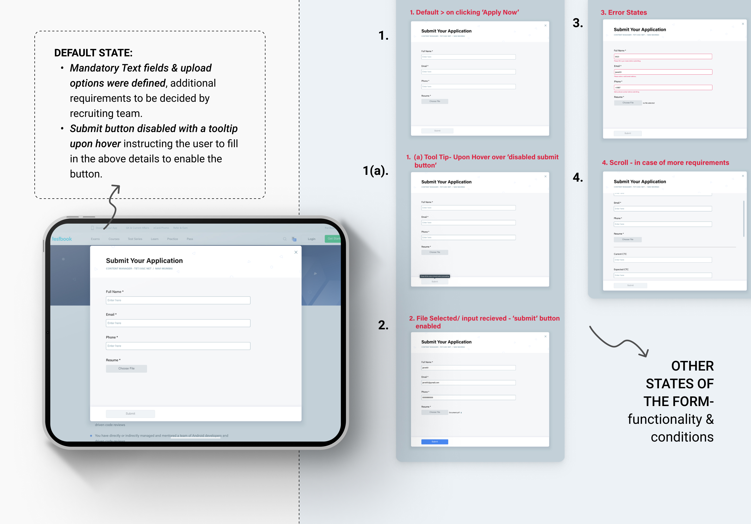
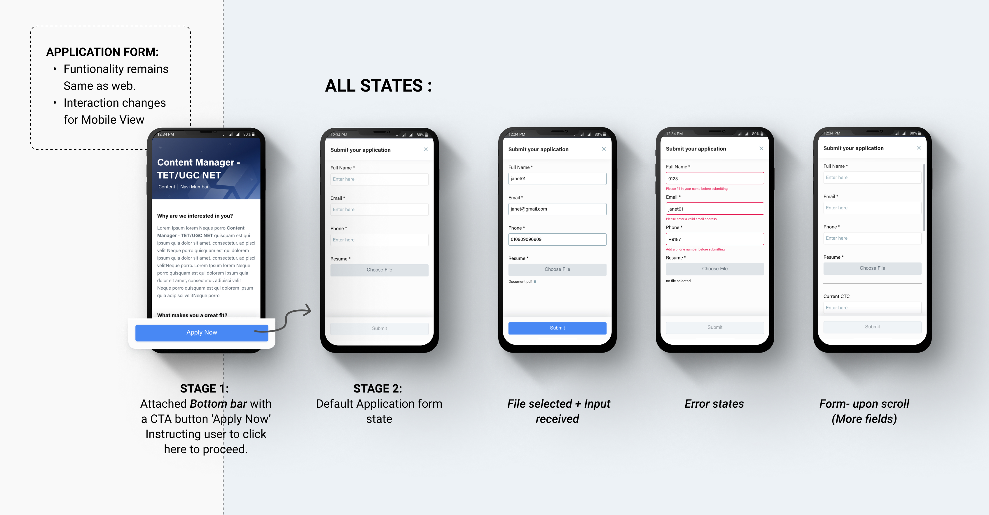
The Application Form designs for both Web & Mobile Web:
After Thoughts:
Presently the design is ready to get into the dev pipeline. The impact & success would be measured after the pages go live. For future improvements I have a couple of suggestions:
- Considering adding a blog section & page where employees have written their experiences would have greater impact than testimonials.
- Application form with a pop-up interaction may not be the best way to put up information, as the user won’t be able to go back and see the description & if they do details would get lost. This part could help some more iterations.
- The filtering option among teams with large openings in the job posting section for Mobile web was removed, because of technical constraints. I think certainly there would be ways to solve this problem.